DATE/TIME 📅
September 5th at 1:30 PM (Pacific Time)
DESCRIPTION 📄
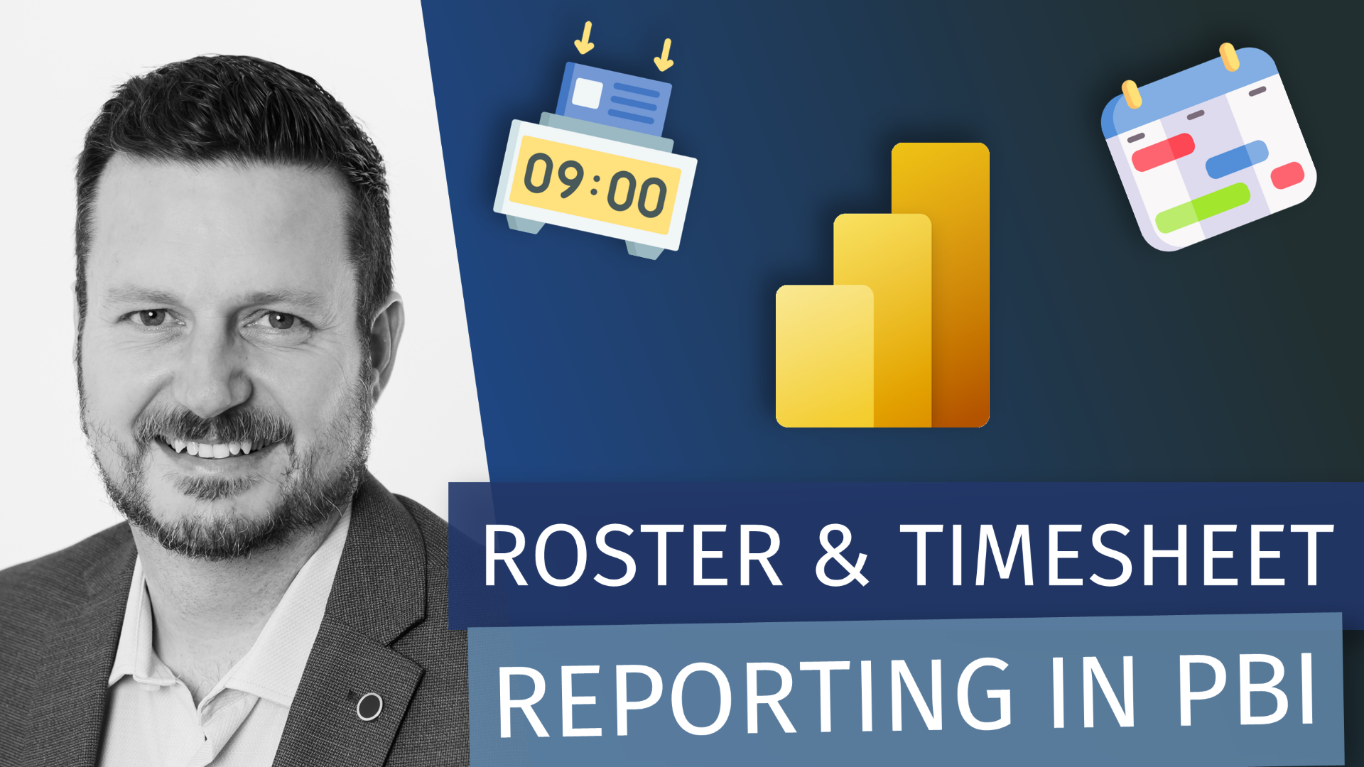
Ready to transform your workforce data from basic hour tracking into strategic business intelligence? This deep dive takes you through real-world techniques for handling complex timesheet analytics with minute-level precision. We'll tackle the challenging DAX calculations, data modeling considerations, and performance optimizations that make the difference between simple reports and enterprise-grade workforce insights that actually drive decisions.
What You'll Learn:
Advanced time intelligence DAX for overlapping shifts and complex scenarios
Data modeling strategies and optimization for granular timesheet data
Roster vs. actual comparison techniques
Real-world implementation patterns from enterprise solutions
Perfect for:
Power BI developers, business analysts, and anyone dealing with complex workforce reporting requirements who wants to move beyond basic time summaries to actionable workforce intelligence.
GUEST BIO 👤
I’m Kane Snyder, a Head of Analytics, Principal Fabric Architect and Analytics Practice Lead with deep expertise in Power BI, DAX and Microsoft Fabric. I’ve guided multiple organisations—across banking and finance, tourism, risk management, environmental emissions, HR, IT governance, law, freight, transport and sales—to build end-to-end analytics solutions that balance cost efficiency with business value. I have a background in business management and have held numerous leadership roles both in business and the analytics space.
I live on the Sunshine Coast in Queensland Australia where I spend my time surfing, camping, 4 wheel driving and playing music.
RELATED CONTENT 🔗
SQLBI Events in Progress DAX Pattern
Kanes Blog
Kanes LinkedIn